Ready To Travel Trip Planner
App 2.0. A more delightful trip planning experience
We redesigned Ready To Travel App by SATS (Singapore Airport Terminal Services Limited) to improve on fulfilling users’ engagement. From receiving suggestions on places of interest as you go to planning a trip with your friends, the new 2.0 App aims to bring us into one seamless experience.
Roles and Responsibilities
Competitive analysis, user journey sketching, wireframing, prototyping, and helping out in writing user test cases. In this project I also get to assist on creating consistent visual styles and interactions.
2018
Design: Creative Director, 2 UI Designers, 1 UX Designer
Project & Engineer: 2 PMs and 10 Engineers on iOS, Android, CMS platforms
Our Challenges
The client came to us with the problem - Customer Retention.
RTT 1.0 App faced a substantial drop-offs right after sign-ups. The users are not utilising the trip planning features. We need to create a better engagement experience and upkeep users’ interest level.
Before the revamp
Looking through the 1.0 App, we can already pin point various reasons why users are not coming back. But let us distill down to just 3 biggest reasons.
Visuals: Brand colour does not look welcoming. (It is a travel app, where are the gorgeous mountains and cityscapes images? We certainly did not feel inspired to plan for any trips.)
Difficulty in planning: Adding and editing trip is too cumbersome and took way too many steps.
Lack of recommendations and relevancy: There were no content or ideas on places of interests. Users were able to add locations which were irrelevant to the destination that they were planning on.
Discovery and Insights
To start with research on other competitors, there is already a considerably good number of existing trip planning apps out in the market. During competitive analysis, we found out that there isn’t really an all-rounder app which users can receive relative recommendations while pinning down their plans. There is also a lack of collaboration amongst friends.
Understanding users
To gain insight on how people plan trips when travelling with others, we did a quantitative survey to understand what the people are looking out for during trip planning.
Examples of questions in our survey:
“ What are the travel essential info which will help when you are planning for a trip. (Etc: Visa Requirements, Currency Converter)
Which factors are important to you when you make the decision about which places of interest, restaurants/cafes or activities to include for your holiday? ”
One of the considerable competitor – Google Trips is saying goodbye! :( (updated in Jun 2019)
Also did some user testings on the old app.
Summary of findings
Users would love to know recommendations around the vicinity of the place they are planning to go. Currently they have to toggle in between apps in order to plan their trips. (Google Maps to find out the location, RTT app to input their plans)
Always have e-documents all over the places (etc: different email, flight and hotel apps…)
Love to collaborate and plan the trip with their friends and family.
Travel advisories are always super useful
The HMWs
How do we get there?
Though Trip Planner is the key feature of this app, but there are much more pieces that comprises the whole app. We also relook into the whole architecture.
Sketches
We spent sometime to generate sketches on initial ideas.
Wireframing
From the sketches, we went on to create a hi-fidelity wireframes using content as accurate as possible.
The Redesign
After rounds of iterations, we redesigned the flow of adding an activity to your itinerary. We also introduced a ‘folder‘ to safe keep all travel documents. Though ‘friends invite‘ was available in the old app, but we improved and added a few more features. Users can now collaborate with friends and can keep track of the updates of each activity.
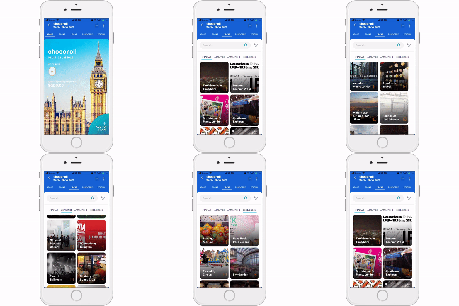
Recommendations around the location of the activity you have added
Users are now able to find things to do around the vicinity after each activity is added to the itinerary.
We also include the ideas section that is categorised under (Popular, Activities, Attractions, Food / Drinks) within the trip to cater for users who just want to browse with no specific places in mind.
A folder for all your travel documents
To ditch the old-school way of printing your travel related documents, there is a place to safe keep all documents pertaining to the trip now. Users need not fumble through different emails to find the documents they need.
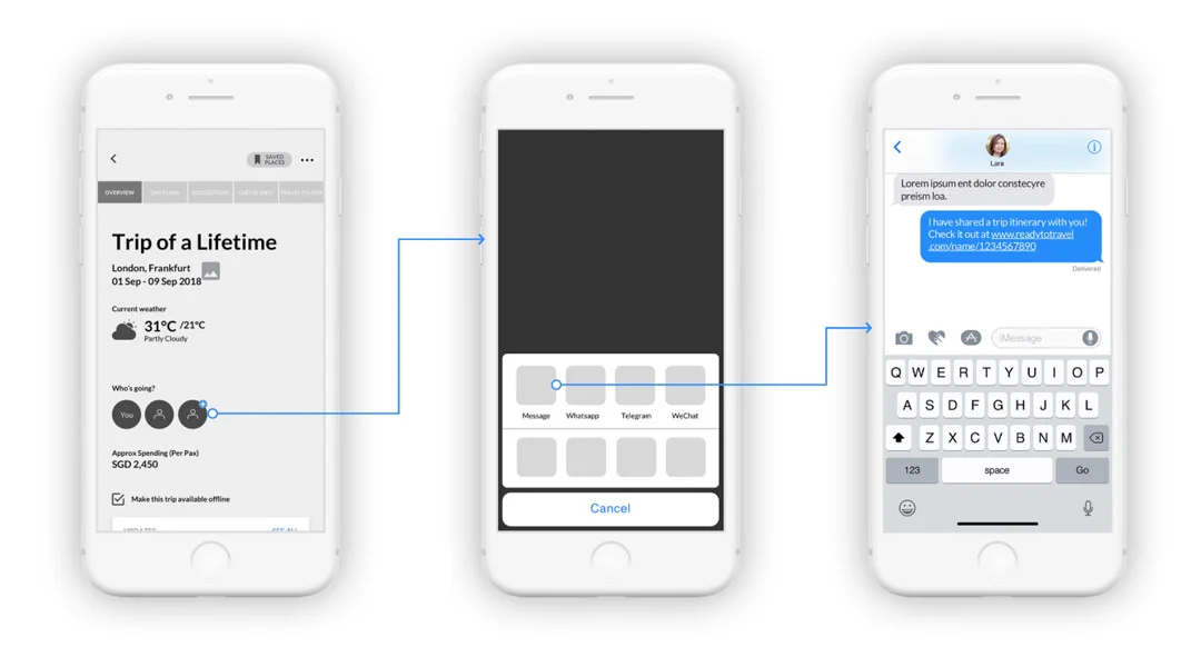
No need to plan alone anymore
We simplified the way of inviting your friends to your trip. They can now join you in planning within a single tap of the link and everyone is synced.
We also included a friends’ update section for you to see what your friends’ have planned.
Essential tips and advisories are part of the trip
From the surveys and feedbacks, useful advisories always come in handy for travellers. Therefore we have catered a screen to house these essential content, so users can now have access to the information in relation to their trip.
What’s next?
Another important part of the app is Shop, which provides Travel Essentials services to complete the whole travelling experience. (read more about it here).
Right after the design phase for mobile app is done, we moved on to work on the website as well. Though key functionalities will not differ too much, there are still much to plan and learn as the website has more screen real estate. Will get to share more when the project is ready.
Takeaways and learnings
The biggest lesson this project has given to me is the importance of informing design decisions with the clients and developers.
Brainstorming ideas as a group can gather everyone from different angles (as a business, as a user, and the feasibility of engineering). We can align ourselves as a team and could potentially kill a lot of unforeseen technical complications at the later stages.
Still have much to learn. A special shoutout and big thank you to my Creative Director and team members who have guided and supported me along the way!


